Text Field
The Text Field component is a single-line text input for arbitrary data. It supports typeahead with autocomplete from a static list or an asynchronous source, as well as input masks for enforced data formatting.
Typeahead
In the Data tab, a Typeahead checkbox has appeared. Activating it provides the ability to select a list generation method and a text field for entering the corresponding list:
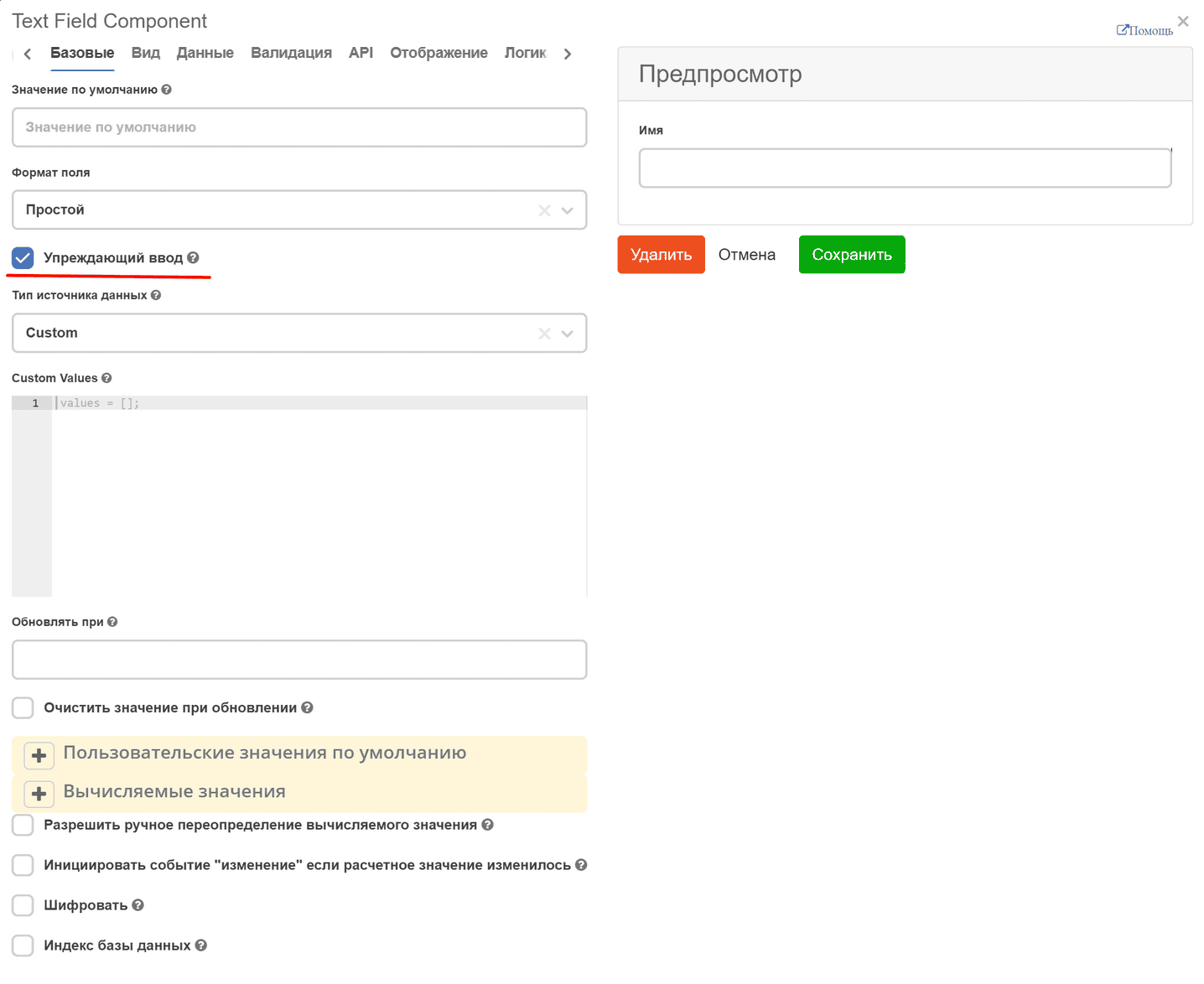
Custom - enter code in the format:
values = ['one', ‘two’];
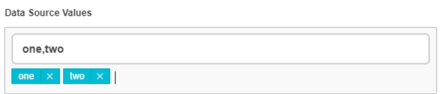
Values - an input where values are entered and added by pressing Enter (uses the Tags component):
Raw JSON - enter data in JSON string format into the text field:
"[\n \"one\",\n \"two\",\n \"three\",\n 4,\n 5,\n \"six\"\n]"
To display keys of components already added to the form, the base form component’s key field has been extended. Now, when adding a new component to the form (or when editing), a reference to the form is stored in instance.root.options._webform, from which the list of added components can be retrieved, for example:
const rootFormComponents = _.get(instance, 'root.options._webform.components') || [];

values = Object.keys(utils.flattenComponents(rootFormComponents));
To support asynchronous requests in the Custom source type, the values variable must be assigned a promise that should return an array of strings
values = window.Records.get('emodel/type@type').load('model.attributes[]{id}');
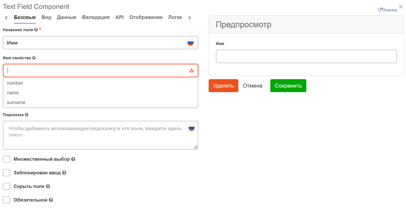
Now, when adding a new component to the form, a dropdown list appears when entering a property name (if there are partial name matches). This helps to understand which names are already taken to avoid errors when creating or editing the form.
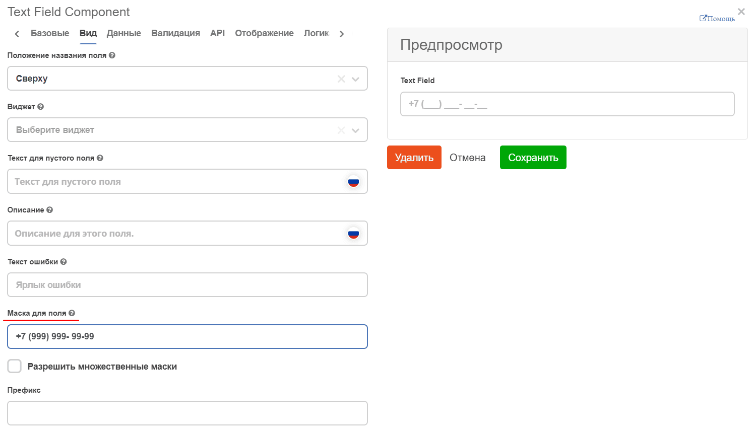
Input Mask
In the View tab, you can predefine the input format. The mask is useful for enforcing input formats such as phone numbers, postal codes, etc.
In the Input Mask field, enter a mask using:
9: numeric
a: alphabetic
: alphanumeric
For example: